Initialization Settings
When initializing the Stripo Plugin, you can configure various parameters to customize its behavior and functionality. Below is a list of possible parameters.
| Parameter | Description |
|---|---|
Required parameter. | Additional data to be passed during the initialization. This can include user-specific or email-specific metadata. A detailed description can be found in the metadata section |
| Called by the editor to obtain an authentication token. Parameters:
|
Only for emails opened for the first time in the plugin or when using the forceRecreate=true parameter | The HTML content of the email template to be loaded into the editor. |
css | The CSS styles associated with the email template. |
name | The name of the email template. The email name is used to set the default value of the utm_campaign parameter. This helps in tracking the campaign associated with the email by automatically populating the utm_campaign field with the email's name. |
utm | UTM parameters for tracking purposes, such as source, medium, campaign, content, and term. A detailed description can be found in the UTM Parameters. |
locale | The locale setting for the editor, determining the language and regional settings. Supported locales: {“en”, “pt”, “cs”, “de”, “es”, “fr”, “it”, “nl”, “pl”, “sl”, “tr”, “zh”, “uk”, “ru”} Default value: “en” |
forceRecreate | A boolean parameter that forces the replacement of an existing email in Stripo’s database with new HTML and CSS during editor initialization. This parameter works only if no one is currently working on the email. |
ignoreClickOutsideSelectors | An array of element selectors on the page specifies which elements should ignore clicks and not reset the selected block. This means that when these elements are clicked, they won't cause any changes to the currently selected block, maintaining the user's focus and selection. Sample: [".ignore-click", "#skip-element"] |
panelPosition | Panel positioning on the screen:
|
notifications | Set of methods for displaying notifications. A detailed description can be found in the notifications section. |
textEditorAllowedPasteContent | Set of tags and attributes allowed to be pasted into a text block. This is useful for limiting unsupported markup when copying code from external sources. A detailed description can be found in the textEditorAllowedPasteContent section. |
textEditorAllowedPasteContent | The default search string for images from the "Stock" tab in the gallery (if enabled) refers to the pre-configured keyword or phrase used to automatically search for and display a set of default images when the Stock Images tab is opened. This helps to provide users with an immediate selection of relevant images without requiring them to enter a search term manually. Default value depends on current season: “spring” / “summer” / “autumn” / “winter” Sample: "summer" |
codeEditor | The initial settings for displaying the code editor are specified in detail in the codeEditor section. These settings define how the code editor will appear and function when first opened, including aspects such as layout, themes, and default configurations. For a comprehensive explanation of these settings, refer to the codeEditor section. |
codeEditorButtonSelector | The CSS selector for the element to which a click handler for opening/closing the code editor will be automatically added. Sample: ".code-editor-button" |
mergeTags | The list of merge tags to be added to the text block editing panel is specified in the mergeTags section. These merge tags allow users to dynamically insert personalized content into emails, such as recipient names or other variables. For a comprehensive description and how to use these merge tags, refer to the mergeTags section. |
socialNetworks | The list of social networks to be added to the social networks block is specified in the socialNetworks section. This list defines which social media platforms will be available for inclusion in the block, allowing users to link to their social media profiles or share content. For a detailed description and configuration options, refer to the socialNetworks section. |
specialLinks | The list of links to be added to the link selection component is specified in the specialLinks section. This list provides predefined links that users can easily add to their content. For a detailed description and usage instructions, refer to the specialLinks section. |
editorFonts | The list of fonts to be included in the Text Editor panel and the Settings panel for basic blocks is specified in the editorFonts section. This list defines the available font options that users can choose from when editing text. For a detailed description and configuration options, refer to the editorFonts section. |
conditionCategories | The display condition settings are specified in the conditionCategories section. These settings determine the conditions under which certain elements will be displayed, allowing for dynamic content presentation based on specified criteria. For a detailed description and configuration options, refer to the conditionCategories section. |
undoButtonSelector | The CSS selector for the element to which a click handler for undoing the last action will be automatically added. Sample: ".undo-button" |
redoButtonSelector | The CSS selector for the element to which a click handler for redoing the last undone action will be automatically added. Sample: ".redo-button" |
mobileViewButtonSelector | The CSS selector for the element to which a click handler for switching to mobile view will be automatically added. Sample: ".mobile-view-button" |
desktopViewButtonSelector | The CSS selector for the element to which a click handler for switching to desktop view will be automatically added. Sample: ".desktop-view-button" |
onTemplateLoaded | The onTemplateLoaded function is called by the editor after the email has been rendered and the editor is ready to work. This function helps to notify your application that the email template is fully rendered and ready for interaction. Usage: Define the onTemplateLoaded function during the initialization of the Stripo editor. This function can be used to execute any custom code or logic you need once the email is fully loaded and ready for editing.Sample: js This callback ensures that your application can perform any necessary actions or updates once the email rendering process is complete, improving the overall user experience and workflow integration. |
onCodeEditorVisibilityChanged | The onCodeEditorVisibilityChanged function is called by the editor when the code editor is opened or closed. This function helps to notify your application about changes in the visibility of the code editor, allowing you to handle these changes appropriately.Parameters:
Usage: Define the onCodeEditorVisibilityChanged function during the initialization of the Stripo editor. This function can be used to execute any custom code or logic you need when the code editor's visibility changes.Sample: js This callback ensures that your application can respond appropriately to changes in the visibility of the code editor, providing real-time feedback and handling to enhance the user experience. |
onDisabledBlockClicked | The onDisabledBlockClicked function is called when clicking on a block icon in the block panel that is disabled. This function helps to notify your application about attempts to interact with disabled blocks, allowing you to provide feedback or handle the event appropriately.Parameters:
Usage: Define the onDisabledBlockClicked function during the initialization of the Stripo editor. This function can be used to execute any custom code or logic you need when a disabled block is clicked.Sample: js This callback ensures that your application can respond appropriately to attempts to interact with disabled blocks, providing real-time feedback and handling to enhance the user experience. |
onSettingsPanelPositionChanged | The onSettingsPanelPositionChanged function is called when changing the settings panel position. This function helps to notify your application about changes in the position of the settings panel, allowing you to adjust your UI or perform other necessary actions.Parameters:
Usage: Define the onSettingsPanelPositionChanged function during the initialization of the Stripo editor. This function can be used to execute any custom code or logic you need when the settings panel position changes.Sample: js This callback ensures that your application can respond appropriately to changes in the settings panel position, providing real-time feedback and handling to enhance the user experience. |
onVersionHistoryVisibilityChanged | The onVersionHistoryVisibilityChanged function is called by the editor when the version history is opened or closed. This function helps to notify your application about changes in the visibility of the version history feature.Parameters:
Usage: Define the onVersionHistoryVisibilityChanged function during the initialization of the Stripo editor. This function can be used to execute any custom code or logic you need when the visibility of the version history changes.Sample: js This callback ensures that your application can respond appropriately to changes in the visibility of the version history, providing real-time feedback and handling to enhance the user experience. |
onVersionHistoryReadAccessChanged | The onVersionHistoryReadAccessChanged function is called by the editor when changing the read access to the version history. This function helps to notify your application about changes in permissions related to the version history feature.Parameters:
Usage: Define the onVersionHistoryReadAccessChanged function during the initialization of the Stripo editor. This function can be used to execute any custom code or logic you need when the read access to the version history changes.Sample: js This callback ensures that your application can respond appropriately to changes in version history permissions, providing real-time feedback and handling to enhance the user experience. |
onAutoSaveStarted | The onAutoSaveStarted function is called when the save procedure starts. This function helps to notify your application that the saving process has begun.Usage: Define the onAutoSaveStarted function during the initialization of the Stripo editor. This function can be used to execute any custom code or logic you need when the save process initiates, such as showing a loading indicator or logging the event.Sample: js This callback ensures that your application can respond appropriately to the start of the save process, improving the overall user experience by providing real-time feedback and handling. |
onAutoSaveCompleted | The onAutoSaveCompleted function is called when the save procedure is completed. This function helps to notify your application that the saving process has finished, and it provides information about any errors that may have occurred.Parameters:
Usage: Define the onAutoSaveCompleted function during the initialization of the Stripo editor. This function can be used to execute any custom code or logic you need once the save process is complete, such as hiding a loading indicator, showing a success message, or handling errors.Sample: js This callback ensures that your application can respond appropriately to the completion of the save process, providing real-time feedback and error handling to enhance the user experience. |
onEditorVisualModeChanged | The onEditorVisualModeChanged function is called when the save procedure is completed. This function helps to notify your application that the saving process has finished, and it provides information about any errors that may have occurred.Parameters:
Usage: Define the onEditorVisualModeChanged function during the initialization of the Stripo editor. This function can be used to execute any custom code or logic you need when the visual mode changes, such as adjusting the UI or logging the event.Sample: js This callback ensures that your application can respond appropriately to changes in the editor's visual mode, improving the overall user experience by providing real-time feedback and adjustments based on the current state. |
onUserListChange | The onUserListChange function is called when any user connects or disconnects from the editing session. This function helps to notify your application about changes in the user list, allowing you to manage user presence and interactions in real-time.Parameters:
Usage: Define the onUserListChange function during the initialization of the Stripo editor. This function can be used to execute any custom code or logic you need when the user list changes, such as updating the UI to reflect the current users in the session.Sample: js This callback ensures that your application can respond appropriately to changes in the user list, improving the overall user experience by providing real-time feedback and updates based on the current session participants. |
onEvent | The onEvent function is called after a corresponding event occurs in the editor. This function helps to notify your application about various events, allowing you to handle them accordingly.Parameters:
Usage: Define the onEditorVisualModeChanged function during the initialization of the Stripo editor. This function can be used to execute any custom code or logic you need when the visual mode changes, such as adjusting the UI or logging the event.Sample: js This callback ensures that your application can respond appropriately to changes in the editor's visual mode, improving the overall user experience by providing real-time feedback and adjustments based on the current state. |
Metadata Information
The metadata parameter is mandatory because it is used to identify the email. Additionally, you can specify the username and avatar, which will be used in the version history and during simultaneous editing. You can pass any information needed by the editor, and all these data will be sent to your server in the information provided to the permission checker API.
This is also the right place to define the values for any variables needed during initialization. For example, if a customer configures the folder path for images or modules and needs to operate with specific variables, the editor needs to know the values for those variables. This can be accomplished by including them in the metadata parameter.
The metadata parameter is mandatory because it is used to identify the email. Additionally, you can specify the username and avatar, which will be used in the version history and during simultaneous editing.
| Parameter | Description | Required |
|---|---|---|
emailId | Email identifier | Yes |
username | Username. Used for version history and simultaneous editing | No |
email | User email | No |
avatarUrl | URL to the user's avatar image. Used for visualization during simultaneous editing. | No |
customVar1 | Custom variable 1 | No |
customVar2 | Custom variable 2 | No |
Example:
{
  ...,
  "metadata": {
    "emailId": "123",
    "username": "John Smith",
    "email": "john.smith@stripo.email",
    "avatalUrl": "https://yourdomail.com/avatars/avatar_1.webp",
    "customVar1": "12345",
    "customVar2": "12345"
  },


  ...
}
Use Cases
Version History and Simultaneous Editing:
- The
usernameandavatarUrlhelp in identifying users in the version history and during simultaneous editing.
- The
Folder Paths:
- If the customer configures a folder path for storing images or modules, the
customvariables can be included in the metadata. This allows the editor to know where to save or retrieve these resources.
- If the customer configures a folder path for storing images or modules, the
Custom Variables:
- Any other custom variables required by the editor can be included in the
metadataparameter. For instance, if certain configuration settings or values need to be dynamically provided during initialization, they can be passed here.
- Any other custom variables required by the editor can be included in the
By defining these values during initialization, the editor is equipped with all necessary information to function correctly and efficiently, tailored to the customer's specific setup and requirements.
Please be advised, all the data from this parameter will be included into the uiData parameter within the Email Resources Permissions API.
Notification Settings
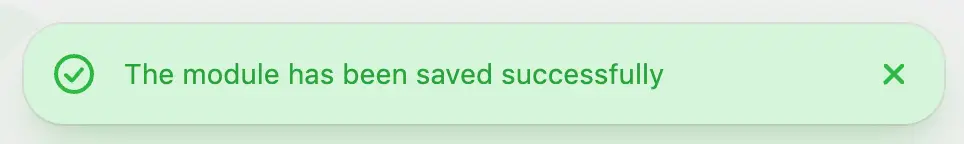
The notifications parameter is used to display different types of messages on the application's UI.
For example,
| Parameter | Description |
|---|---|
info | Used to display informational messages. Parameters:
|
error | |
success | |
warn | |
loader | |
hide | Used to close a message |
Message parameters:
| Parameter | Description |
|---|---|
closeable | True if the message can be closed |
autoClose | True if the message can be automatically closed after a certain period |
customClasses | CSS classes to be added to the message's markup |
action | Adds an action button to the message. Parameters:
|
Example:
{
 ...,
 "notifications": {
   "info": function(message, id, params) { /* Show info message */ },
   "error": function(message, id, params) { /* Show error message */ },
   "success": function(message, id, params) { /* Show success message */ },
   "warn": function(message, id, params) { /* Show warn message */ },
   "loader": function(message, id, params) { /* Show loader message */ },
   "hide": function(id) { /* Hide message by id */ },
 },
 ...
}
Pasting Content Restrictions
The textEditorAllowedPasteContent parameter allows you to restrict the tags and attributes that can be pasted from the clipboard into a text block. This is particularly useful in scenarios where maintaining a consistent and secure format for the text blocks is critical.
Use Case:
Imagine you are developing an email template editor for a marketing platform. To ensure that the pasted content adheres to your formatting standards and to prevent any potential security risks from unwanted HTML tags or attributes, you can use the textEditorAllowedPasteContent option. By defining which HTML tags and attributes are allowed, you can ensure that only specific elements and attributes are included when users paste content into the text editor. Any tags and attributes not specified in the allowed list will be ignored, and the text will be inserted as plain text.
For example, you may want to allow basic formatting tags like <p>, <a>, <strong>, and <em> but restrict other tags that could disrupt the email's design or introduce security vulnerabilities. Additionally, you can specify which attributes are allowed for certain tags, such as allowing only href and title attributes for <a> tags, and src and alt attributes for <img> tags. Other tags and attributes will be stripped out, ensuring that only clean and secure content is inserted.
| Parameter | Description |
|---|---|
tags | An array of tags that are allowed to be pasted |
attributes | An array of attributes that are allowed to be pasted |
{
  ...,
  "textEditorAllowedPasteContent": {
    "tags": ['b', 'strong', 'i', 'a'],
    "attributes": ['href', 'target']
  },
  ...
}
In this example, only the specified tags and attributes will be permitted when pasting the coppied content into the text block. This ensures that the content remains consistent with the desired format and helps prevent any unintended HTML or security issues.
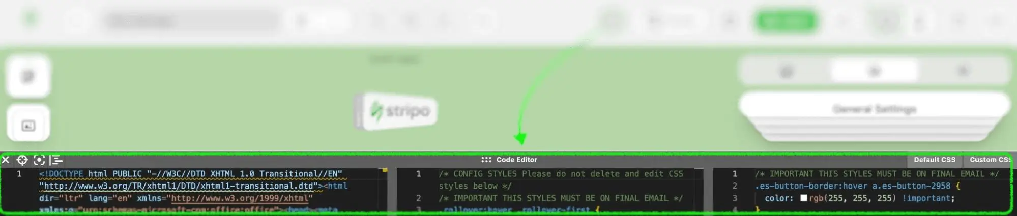
Code Editor Settings
This parameter is used to configure the default display state of the code editor.
| Parameter | Description |
|---|---|
isOpen | True — if the code editor is open by default |
isDefaultCSSOpen | True — if the default CSS section is open by default |
isCustomCSSOpen | True — if the custom CSS section is open by default |
containerHeight | Default height of the code editor in pixels |
defaultCSSPanelWidth | Width of the default CSS section by default in pixels |
customCSSPanelWidth | Width of the custom CSS section by default in pixels |
Example:
{
  ...,
  "codeEditor": {
    "isOpen": false,
    "isDefaultCSSOpen":true,
    "isCustomCSSOpen": false,
    "containerHeight": 80,
    "defaultCSSPanelWidth": 100,
    "customCSSPanelWidth": 100
  },
  ...
}
In this example, the code editor is initially closed (isOpen: false), the default CSS section is open (isDefaultCSSOpen: true), and the custom CSS section is closed (isCustomCSSOpen: false). The default height of the code editor container is set to 80 pixels, and both the default and custom CSS panel widths are set to 100 pixels.
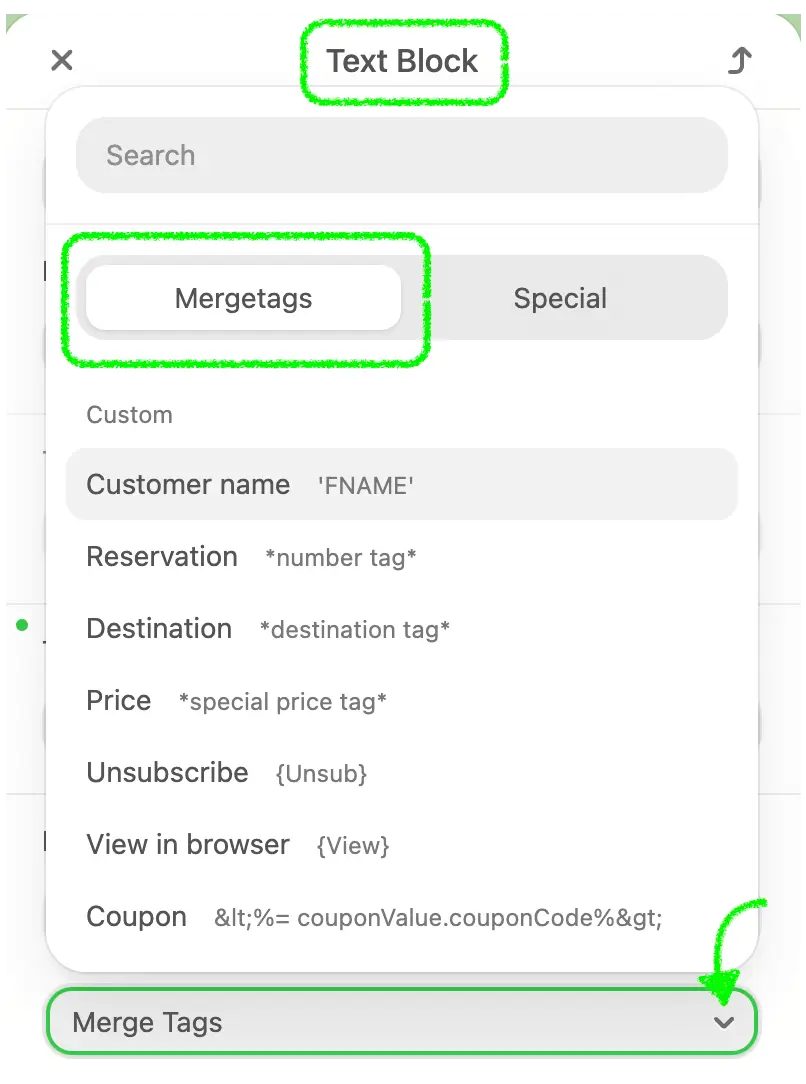
Merge Tags Setup
The mergeTags parameter is used to specify merge tags displayed in the settings of a text block. Merge tags are placeholders that dynamically insert personalized content, such as a recipient's name or other specific information, into the text. This is particularly useful in email marketing, where personalization can significantly improve engagement and response rates.
Use Case:
Imagine you are developing an email marketing platform that allows users to create and send personalized emails to their subscribers. To enhance the effectiveness of these emails, you want to allow users to insert personalized content easily. The mergeTags parameter lets you define which merge tags are available for users to insert into their email text blocks. For example, you might want to include merge tags for the recipient's first name, last name, and specific campaign details.
By defining these merge tags, users can quickly add personalized elements to their emails without manually inputting each recipient's information. When the email is sent, the merge tags are replaced with the actual data for each recipient, creating a more personalized and engaging message.
| Parameter | Description |
|---|---|
category | Name of the merge tag group |
entries | An array of merge tags, where:
|
Example:
{
  ...,
  "mergeTags": [
    {
      "category": "eSputnik",
      "entries": [
        {
          "label": "First Name",
          "value": "%FIRST_NAME%"
      ]
    }
  ],
  ...
}
In this example, there are two categories of merge tags: "eSputnik" and "Campaign." Each category contains entries with labels and values that will be displayed in the text block settings. For instance, the "eSputnik" category includes merge tags for "First Name" and "Last Name," allowing users to personalize emails with the recipient's name. The "Campaign" category includes tags for "Campaign Name" and "Campaign Date," enabling users to insert specific campaign-related information.
Using these merge tags, users can effortlessly create personalized and targeted email content, improving the overall effectiveness of their email marketing campaigns.
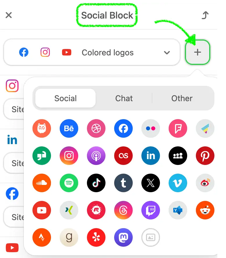
Social Networks Configuration
The socialNetworks parameter is used to specify the list of social networks that will be added to the social networks block. This feature is especially useful for individuals or businesses who want to include links to their social media profiles directly within their email templates, allowing recipients to easily connect with them across various platforms.
Use Case:
Imagine you are creating an email template for a marketing campaign. Including links to your social media profiles in the email can increase engagement and drive traffic to your social media pages. By specifying the socialNetworks parameter, you can define which social media icons and links should be displayed in the email's social networks block. If this parameter is specified with social networks, these icons will be added by default once the social network block is dropped into the email template. This ensures that your audience can easily find and follow your social media accounts, helping to build your online presence and foster community engagement.
| Parameter | Description |
|---|---|
name | Name of the social network |
href | URL of the social network profile |
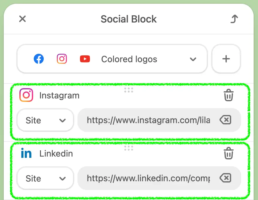
Example:
{
  ...,
  "socialNetworks": [
    {
      "name": "facebook",
      "href": "https://facebook.com"
    }
  ],
  ...
}| Category | Names |
|---|---|
socials | facebook, twitter, instagram, linkedin, pinterest, snapchat, youtube, tiktok, vimeo, reddit, tumblr, weibo, threads, discord, mastodon, custom |
chat | whatsapp, messenger, telegram, skype, hangouts, viber, wechat, slack, teams, zoom |
others | askfm, workplace, blogger, behance, email, dribbble, website, flickr, foursquare, gmail, glassdoor, iTunesPodcasts, tripAdvisor, lastfm, rss |
| appstore, myspace, line, windowsstore, soundcloud, medium, spotify, dropbox, googledrive, github, pdf, doc, xls, ppt, onedrive, meetup | |
| patreon, kofi, buyMeACoffee, yammer, huaweiAppGallery, googleBusiness, strava, google, goodreads, yelp |
Using the socialNetworks parameter ensures that the social media links are consistently formatted and easily accessible, enhancing the overall effectiveness of the email marketing campaign by encouraging social media interaction and engagement.
Special Links Configuration
The specialLinks parameter is used to specify a list of links that will be added to the link selection component. This feature is particularly useful for adding commonly used links, such as unsubscribe, support, or social media profile links, directly into email templates. It ensures consistency, saves time, and makes the email creation process more efficient.
Use Case:
Imagine you are managing an email marketing platform where users frequently need to include specific links in their email templates, such as unsubscribe links or customer support links. Manually entering these URLs each time can be tedious and prone to errors. The specialLinks parameter allows you to define these essential links once, and then make them easily accessible for users to insert into their emails.
For example, you might want to include links for unsubscribing from the newsletter, contacting support, or viewing email in browser. By using the specialLinks parameter, you can group these links under specific categories, making it easy for users to find and insert them into their emails
| Parameter | Description |
|---|---|
category | Name of the group of links |
entries | An array of links, where:
|
Example:
{
  ...,
  "specialLinks": [
    {
      "category": "eSputnik",
      "entries": [
        {
          "label": "Unsubscribe",
          "value": "https://esputnik.com/unsubscribe"
        }
      ]
    }
  ],
  ...
}
This approach not only ensures that the links are correctly formatted and consistently used but also significantly speeds up the email creation process. It reduces the likelihood of errors and enhances the overall user experience by providing quick access to frequently used links.
Using the specialLinks parameter, you can help users maintain a high standard of professionalism and compliance in their email campaigns while also making the editing process more efficient and user-friendly.
Font Options
The editorFonts parameter allows for comprehensive font management within your email editor, enabling you to tailor the list of available fonts to meet various needs. Here are some scenarios where this can be beneficial:
- User Customization: If you want your users to customize the list of fonts available in the editor while they edit emails, you can create an interface in your app to manage this. The editor can then be configured to load these custom fonts.
- Brand-Specific Customization: As a digital marketing agency, you may need to customize the list of fonts in the editor to align with a client's branding when creating their email templates.
With this option, you can:
- Expand the Font List: Add custom web fonts from popular services like Google Fonts, expanding the list of available fonts in the editor.
- Reduce the Font List: Limit the list of available fonts by removing the default fonts, providing a more focused selection for your users.
| Parameter | Description |
|---|---|
showDefaultStandardFonts | This boolean parameter specifies whether to display the entire standard fonts list. The default value is true. |
showDefaultNotStandardFonts | This boolean parameter specifies whether to display the entire non-standard fonts list. The default value is true. |
showDefaultNotStandardFonts | This parameter includes an array of custom fonts to be added to the fonts list. Each element can have the following properties:
|
Use Case Examples:
- User Customization: Suppose you run a platform where users create their own email templates. By allowing them to customize the font list, you give them the flexibility to use their preferred fonts, enhancing their creative control.
- Brand-Specific Customization: If you are a digital marketing agency creating email templates for a client, you might need to use fonts that match the client's brand guidelines. The
editorFontsparameter lets you customize the font list to include only the fonts that align with the client's branding, ensuring consistency across all communications.
This parameter helps ensure that the fonts used in your email templates are both relevant and visually aligned with your users' or clients' needs.
Conditional Content Display
The conditionCategories parameter is used to specify a list of categories for configuring block display conditions in your email templates. This feature allows you to control the visibility of specific blocks based on predefined conditions, making your emails more dynamic and personalized.
Use Cases:
- Personalized Content: Show different content blocks to different segments of your audience. For example, display a special offer only to female customers or show different products based on user preferences.
- Conditional Display: Include or exclude certain content based on specific conditions, such as geographic location, membership status, or user activity.
- Dynamic Marketing Campaigns: Enhance engagement and relevance by tailoring email content to different user segments.
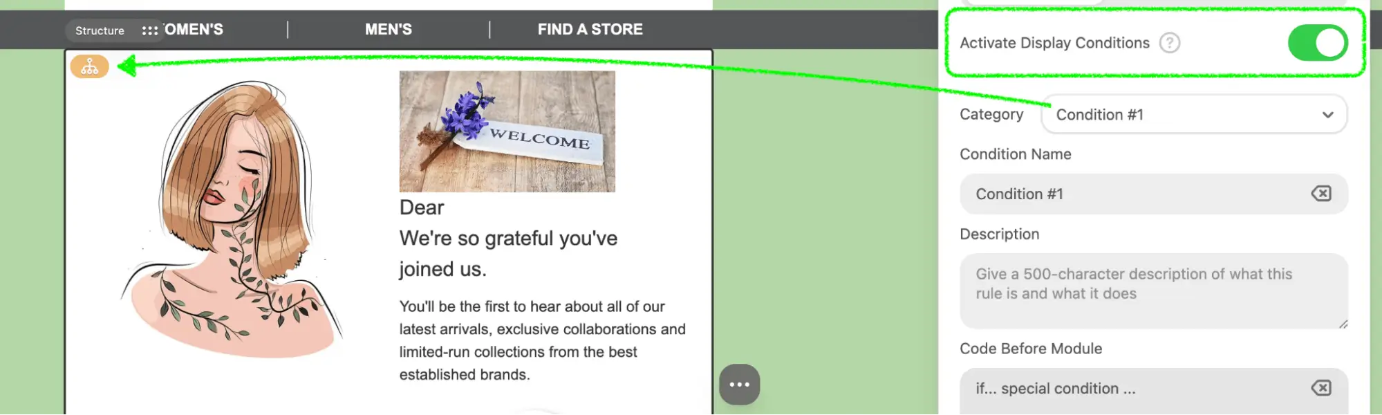
How to Utilize:
- Define Conditions: Use the
conditionCategoriesparameter to define various conditions based on your audience segmentation. For example, create categories like "Gender," "Location," or "Membership Status" and specify conditions for each category. - Insert Scripts: Utilize the
beforeScriptandafterScriptfields to insert conditional statements into your email template. These scripts will control the visibility of the content blocks based on the specified conditions. - Dynamic Content Display: When the email is rendered, these scripts will ensure that only the relevant content blocks are displayed to the recipients who meet the conditions, making your emails more personalized and engaging.
Important Considerations:
- Editor and Application Responsibilities: While the editor is responsible for placing the conditional statements into the correct places within the HTML of the email, it is the responsibility of the application (where the plugin is embedded) to correctly handle these statements when it’s time to send the email, according to their business needs.
- Predefined Conditions Only: Utilize the
beforeScriptandafterScriptCurrently, only predefined conditions are supported. Future updates will include additional conditions as present in the older plugin. - No Language Limitations: The editor does not have any limitations regarding the language of these statements, so they can be written in any scripting language supported by your application.
Parameter Description:
| Parameter | Description |
|---|---|
type | Type of condition. Currently only “PREDEFINED” is supported |
category | Name of the category |
conditions | An array of condition details |
Conditions Details:
| Parameter | Description |
|---|---|
id | Unique identifier of the condition |
name | Name of the condition |
description | Description of the condition |
beforeScript | Content to be inserted into the email before the block with the condition |
afterScript | Content to be inserted into the email after the block with the condition |
Example Usage:
{
  ...,
  "conditionCategories": [
    {
      "type": "'PREDEFINED'",
      "category": "Gender",
      "conditions': [
        {
          "id": 1,
          "name": "Gender - female",
          "description: "Only female customers will see this part",
          "beforeScript": "{% if contact.gender === \"Female\" %}",
          "afterScript": "{% endif %}"
        }
      ]
    },
  ]
  ...
}
Event Handling
The onEvent parameter is used to define event handlers for various actions within the editor. These events help track user interactions and trigger specific functions in response to those interactions. Below is a list of available events and their descriptions, along with the parameters passed for each event.
Available Events:
| Parameter | Description | Event parameters |
|---|---|---|
editor_view_mode_changed | Triggered when switching between mobile and desktop views. | js |
modules_panel_opened | Triggered when opening a tab from the modules panel. | js |
module_dropped | Triggered when adding a module to the email from pre-made or saved ones. | js |
module_saved | Triggered when saving a module. | js |
block_added | Triggered when adding a block (Text, Button, Image) through actions in an empty container. | js |
block_dropped | Triggered when adding blocks to the email from the blocks panel. | js |
block_copied | Triggered when copying a block. | js |
block_deleted | Triggered when deleting a block. | js |
block_moved | Triggered when moving a block. | js |
Example Usage:
{
    "onEvent": function handleEvent(type, params) {
        switch (type) {
            case "editor_view_mode_changed":
                // Handle view mode change
                break;
            case "modules_panel_opened":
                // Handle modules panel opening
                break;
            case "module_dropped":
                // Handle module dropped
                break;
            case "module_saved":
                // Handle module saved
                break;
            case "block_added":
                // Handle block added
                break;
            case "block_dropped":
                // Handle block dropped
                break;
            case "block_copied":
                // Handle block copied
                break;
            case "block_deleted":
                // Handle block deleted
                break;
            case "block_moved":
                // Handle block moved
                break;
            default:
                console.warn("Unhandled event type:", type);
        }
    },
    ...
}
By configuring the onEvent parameter, you can effectively monitor and respond to user interactions within the editor, providing valuable insights and enhancing the overall user experience.
UTM Parameters
The utm parameter is used to configure the initial settings for UTM tags in your email templates. These tags are essential for tracking the performance of your email campaigns in analytics platforms.
Conditions Details:
Imagine you are setting up an email marketing campaign and you need to track its performance in Google Analytics. By using UTM tags, you can identify which email brought traffic to your website and how effective it was in terms of conversions. The utm parameter allows you to predefine these tags, ensuring that all links in your email carry the necessary tracking information.
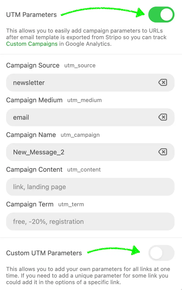
Here's a detailed description of each parameter and its usage.
Parameter Description:
| Parameter | Description |
|---|---|
utmSource | Source of the traffic (e.g., 'eSputnik') |
utmMedium | Medium of the campaign (e.g., 'email') |
utmCampaign | Name of the campaign (e.g., 'Spring_Sale') |
utmContent | Content of the campaign (e.g., 'Banner') |
utmTerm | Term used for paid search campaigns (e.g., 'Discount') |
customUtms | Additional custom UTM tags. Parameters:
|
Example Usage:
{
  ...,
  "utm": {
    "utmSource": "eSputnik",
    "utmMedium": "email",
    "utmCampaign": "Spring_Sale",
    "utmContent": "Banner",
    "utmTerm": "Discount",
    "customUtms": [
      {
        "name": "utmCustom1",
        "value": "someValue"
      }
    ]
  },
  ...
}
Detailed Explanation:
- utmSource: This parameter identifies the source of the traffic. For example, if your emails are sent through the eSputnik platform, you might set
utmSourceto "eSputnik". - utmMedium: This parameter specifies the medium of the campaign. In the case of email campaigns, you would typically set this to "email".
- utmCampaign: This parameter names the campaign. For example, if you are running a Spring Sale, you could set
utmCampaignto "Spring_Sale". - utmContent: This parameter differentiates content within the same ad or campaign. For instance, if you have multiple banners, you could label them individually using
utmContent. - utmTerm: This parameter is used for paid search campaigns to capture the keyword term. Even if you are not running paid search campaigns, you can use this field to track specific promotions or discounts, like "Discount".
- customUtms: This array allows you to add additional custom UTM tags that may be specific to your needs. Each custom UTM includes a
nameand avalue.
How to Utilize:
- Predefine UTM Tags: Set the initial values for UTM tags in your email templates using the
utmparameter. This ensures consistency across all your email campaigns. - Add Custom Tags: Use the
customUtmsarray to include any additional tracking parameters that are unique to your campaign requirements. - Track Campaign Performance: By embedding these UTM tags in your email links, you can track the effectiveness of your campaigns in your analytics platform, such as Google Analytics. This helps you understand which emails drive the most traffic and conversions, allowing you to optimize future campaigns.
By setting up these UTM tags initially, you ensure that all the necessary tracking information is included in your email links, facilitating comprehensive campaign performance analysis.